030 Color System
Naming colours from the city, not from a swatch book
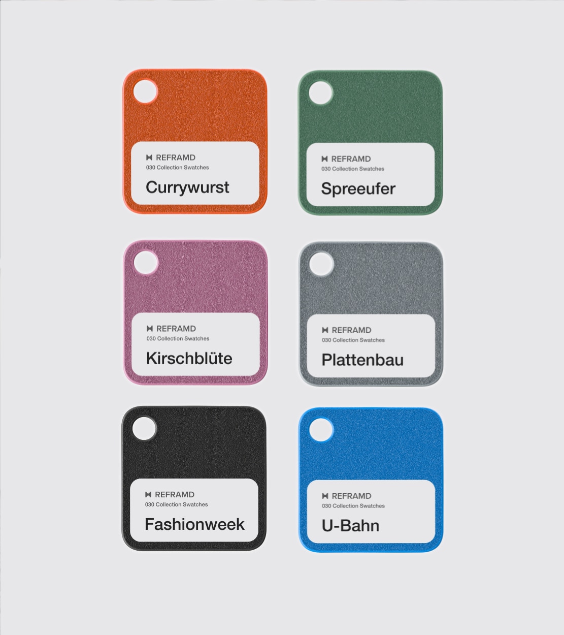
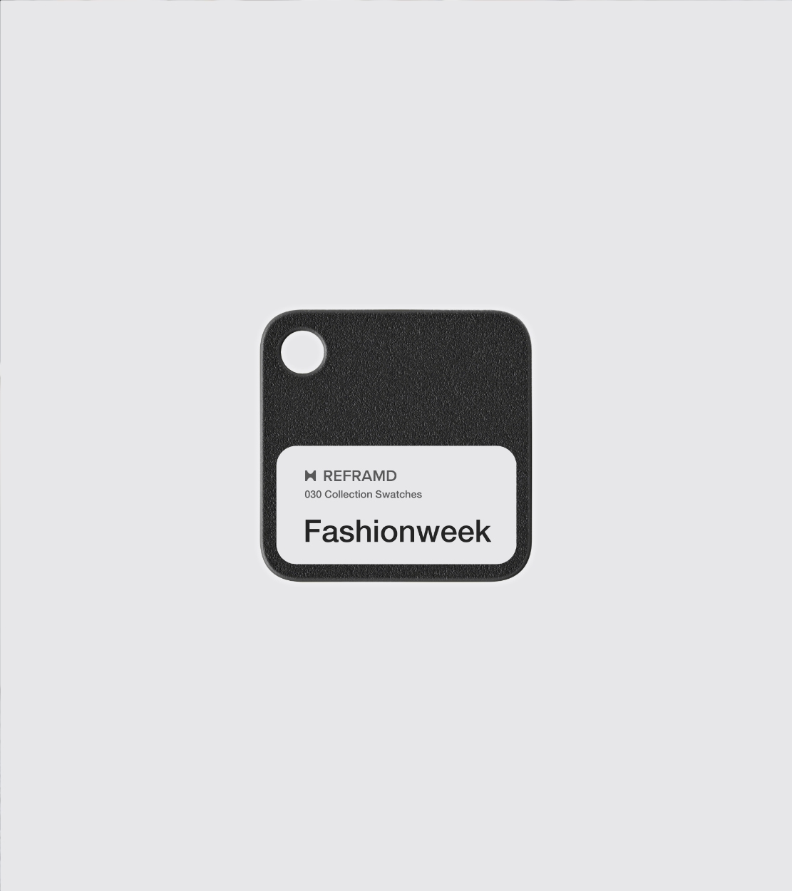
Most collections pick colours and then name them. 030 works the other way round.
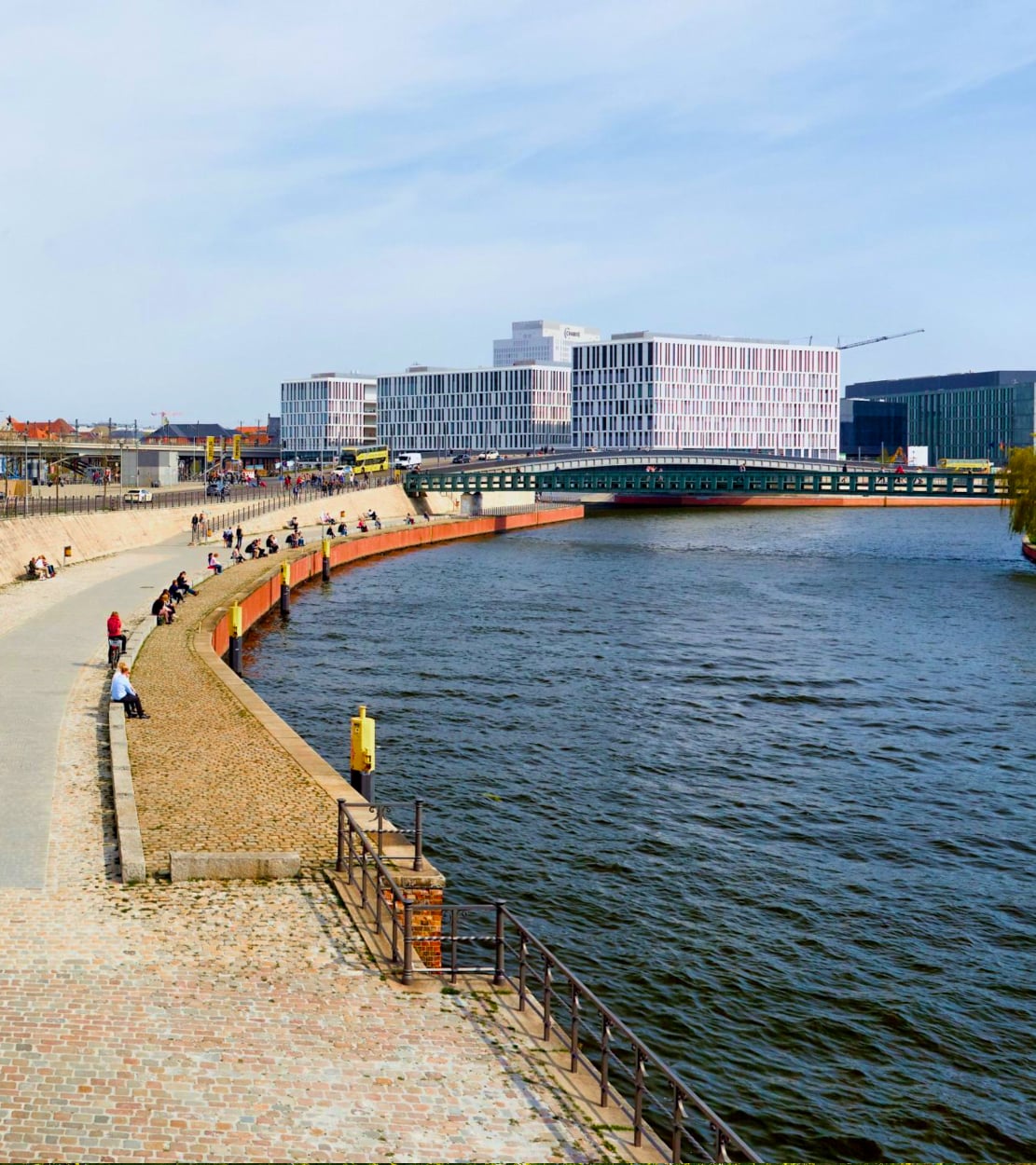
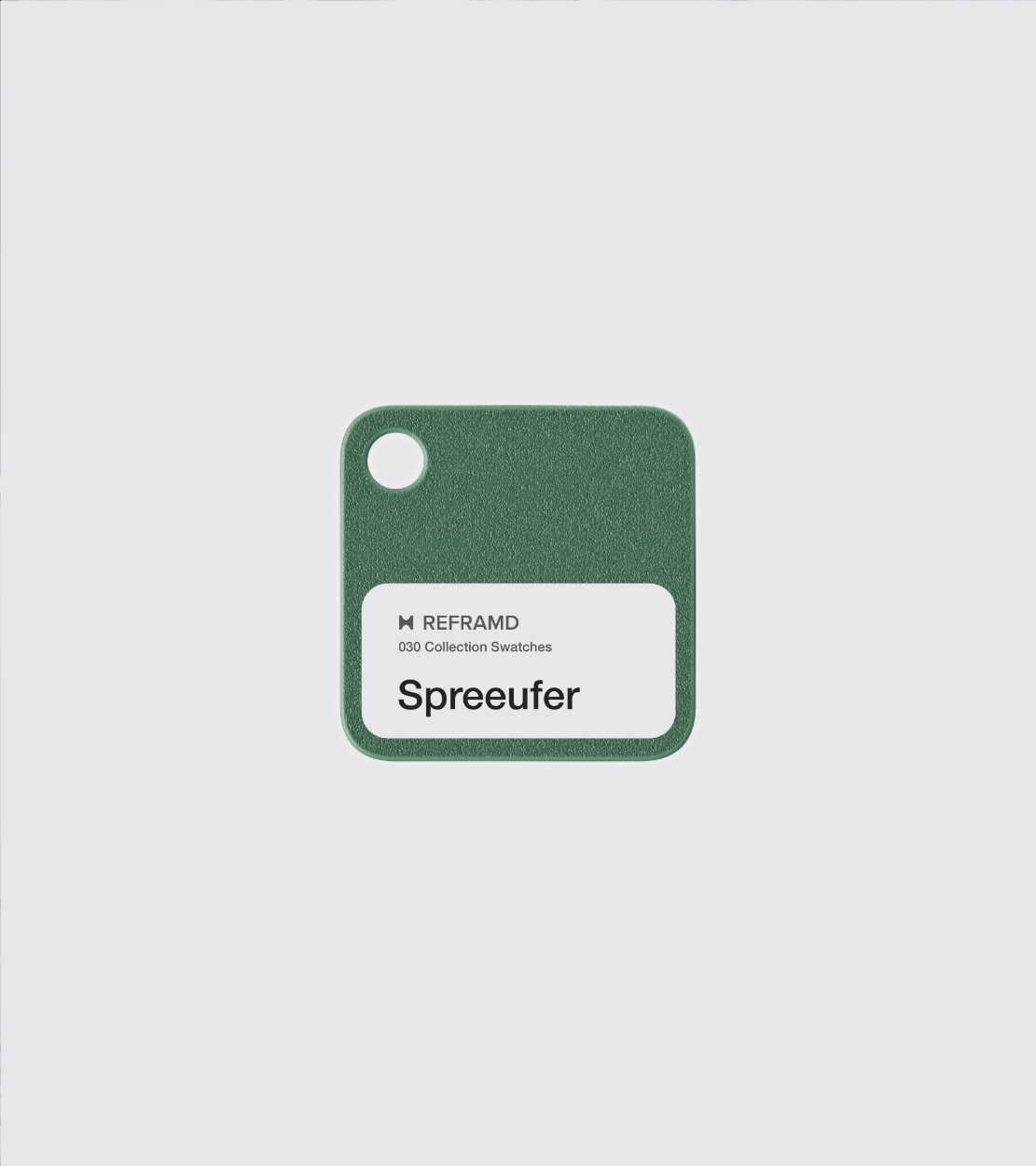
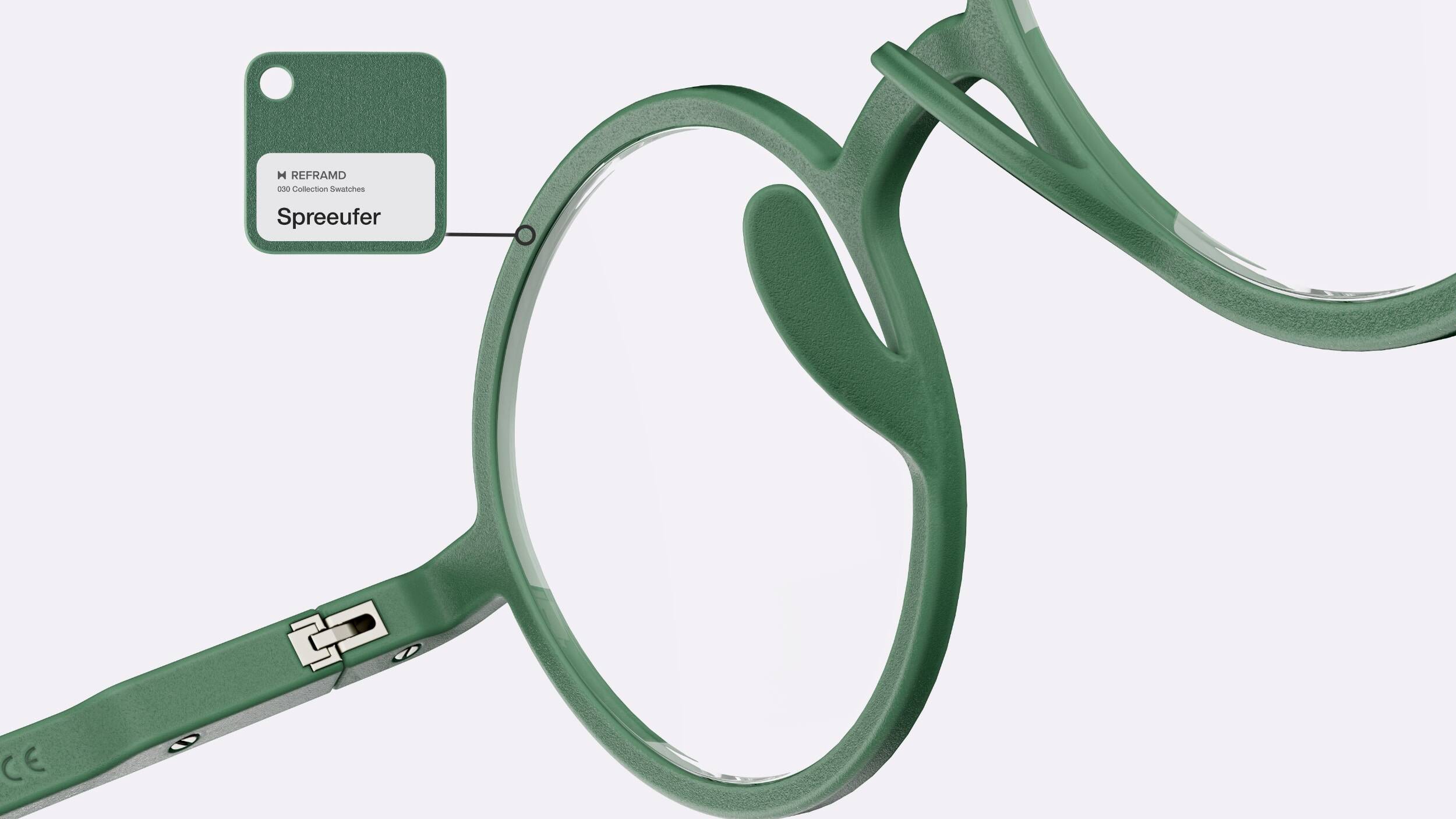
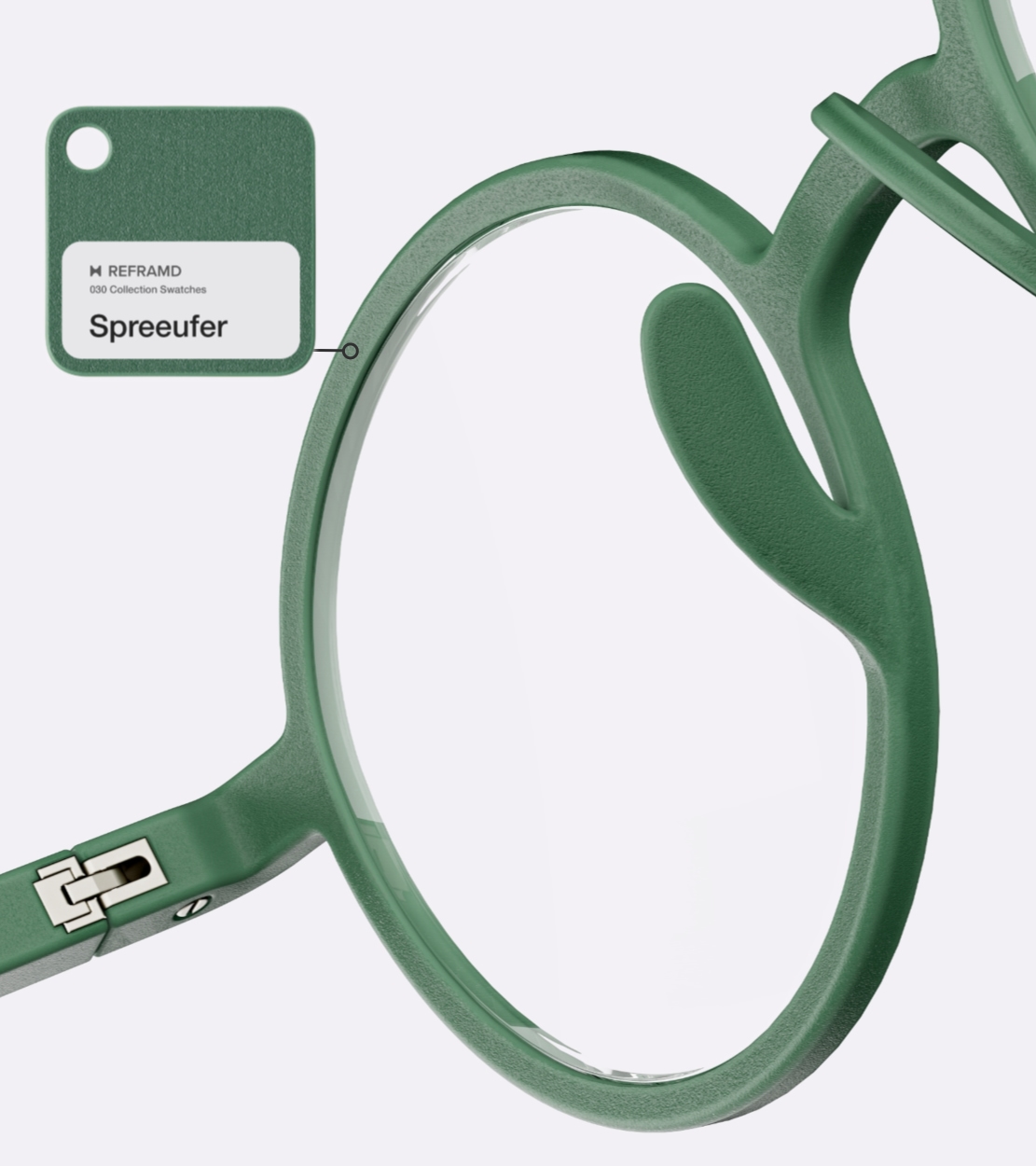
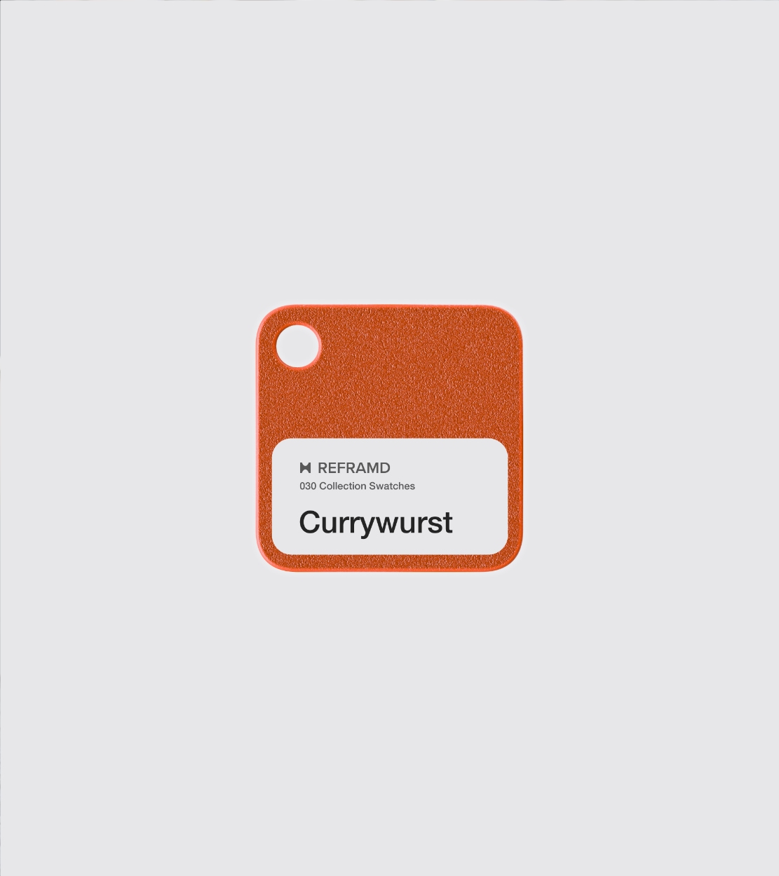
The palette started from contextual references — Currywurst, Plattenbau, Spreeufer — which were then reduced into restrained tones drawn from the associated materials, surfaces and everyday conditions found across Berlin.
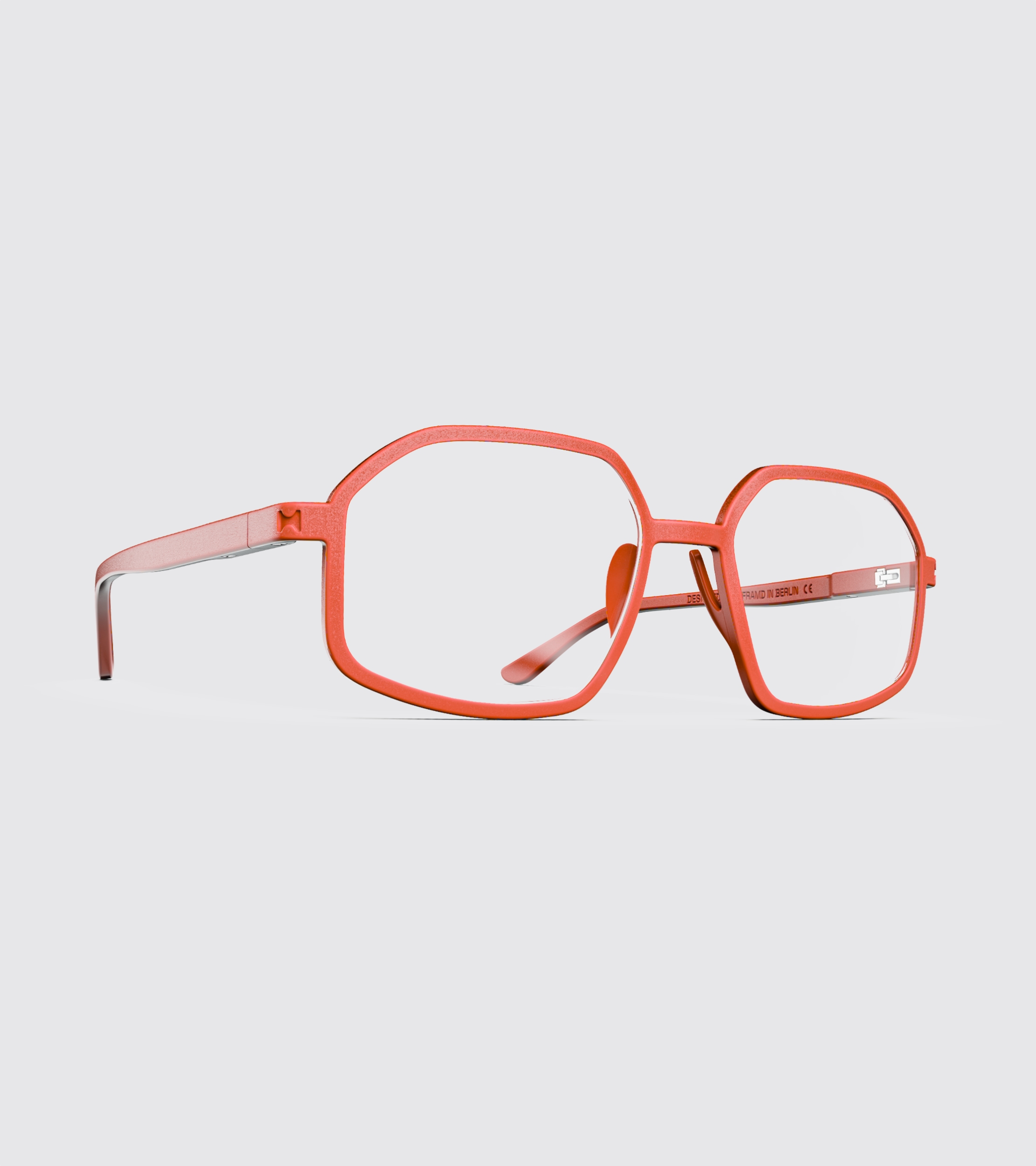
Every colour is available on every frame. That makes the palette a constrained system rather than a series of one-off colourways, and it keeps geometry, fit, naming and CMF operating inside the same structure.
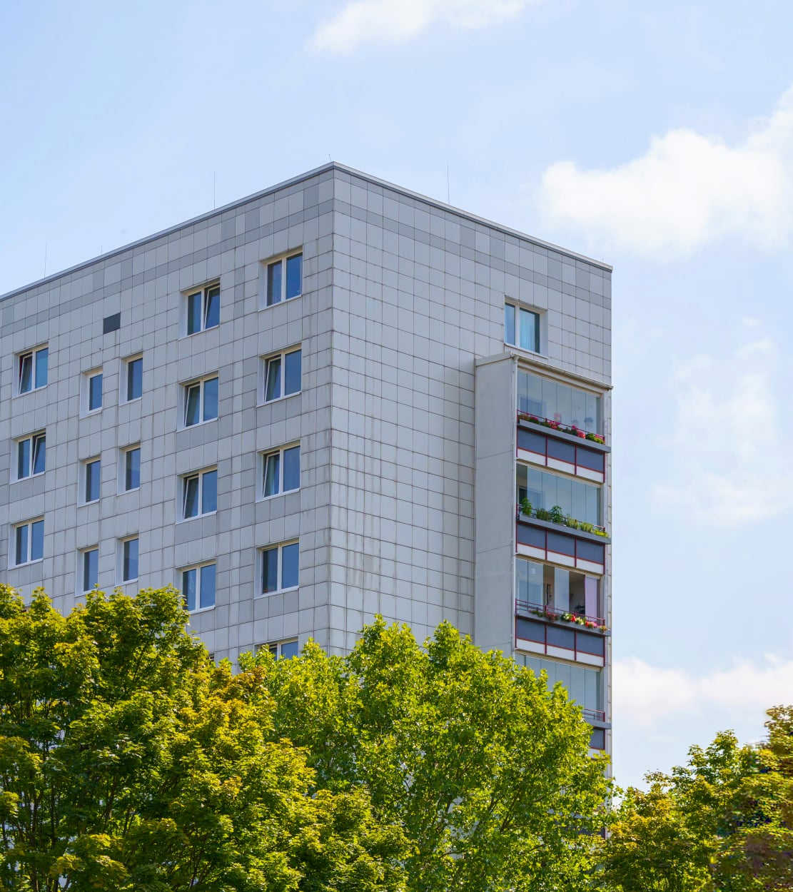
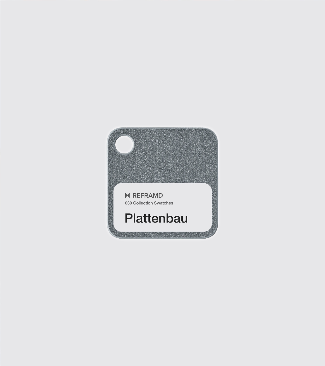
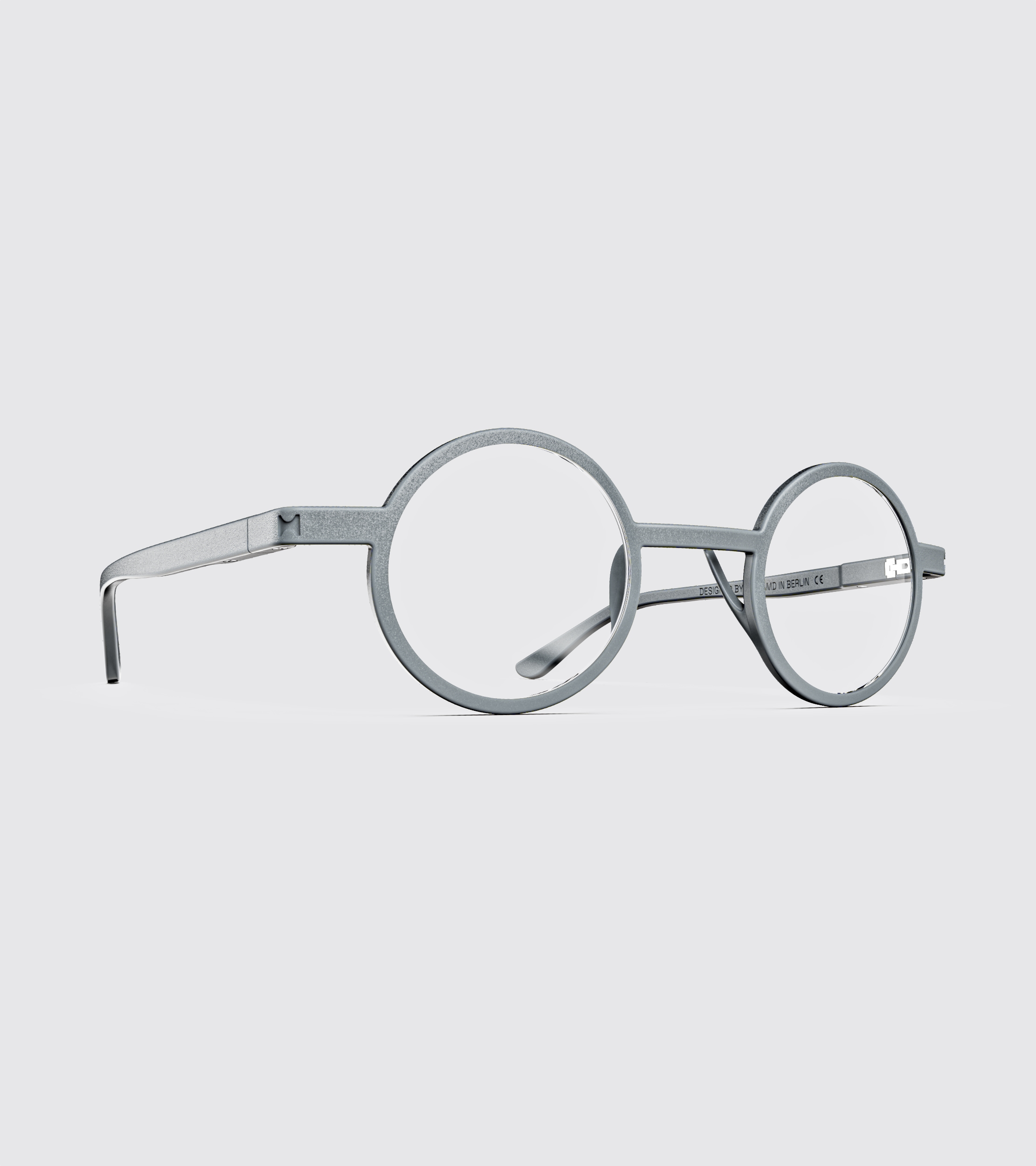
Ground the collection in place
Rather than reproducing landmarks, the palette abstracts Berlin into material and cultural cues: public infrastructure, food culture, concrete housing, transit systems, waterways, urban surfaces — each reduced to a tone that works across the whole collection.
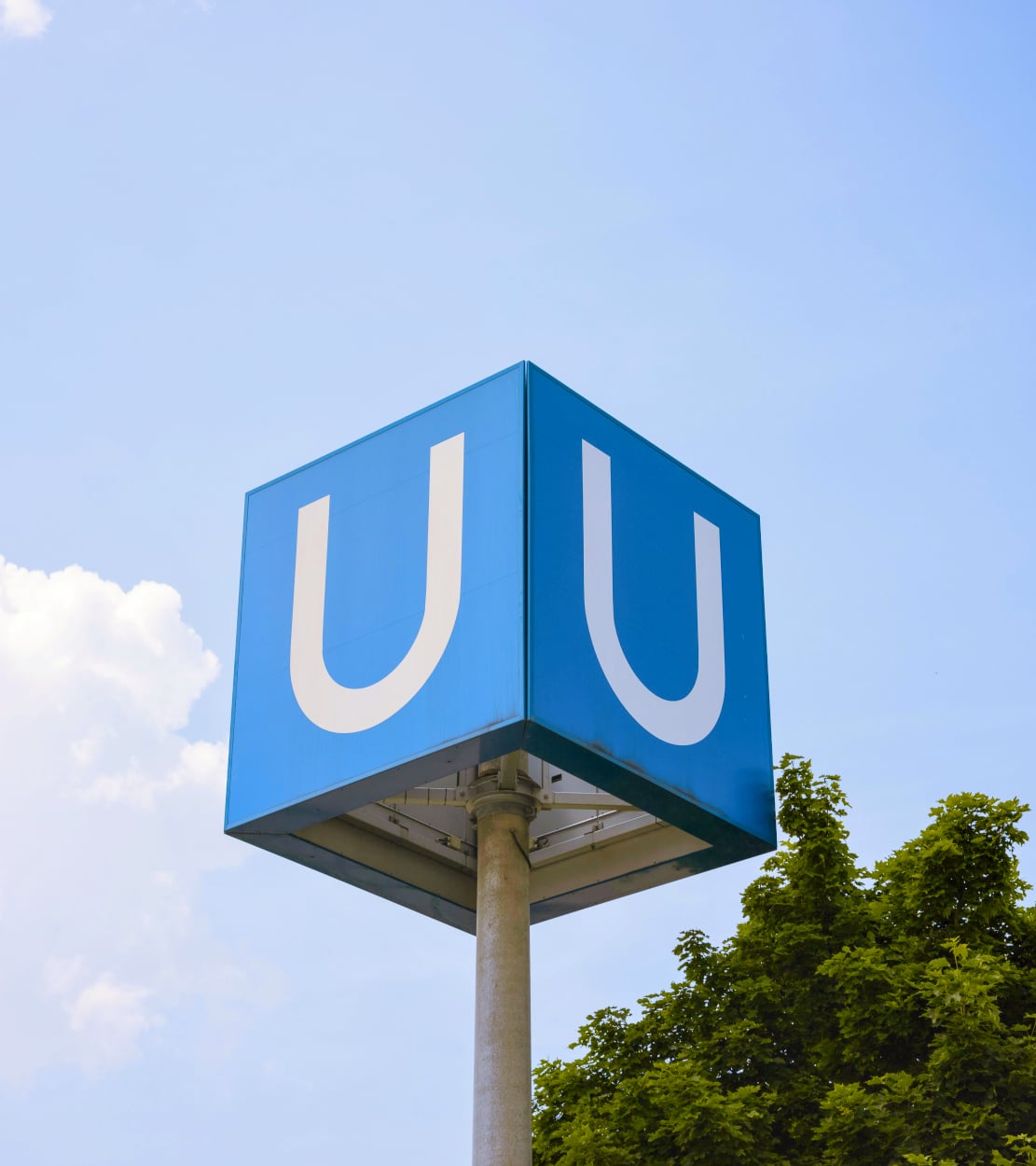
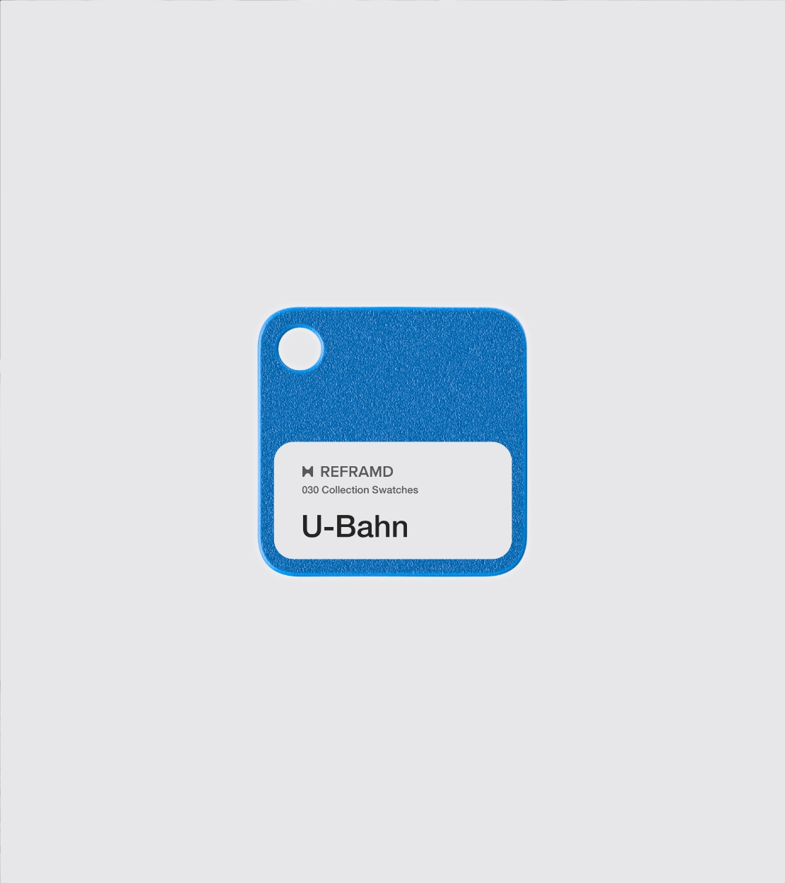

Support the geometry
The colours reinforce the frames rather than compete with them. 030 prioritises geometry, fit, proportion and structural clarity, so the palette stays restrained and materially grounded. The naming follows the same logic: familiar urban references, held back from the literal.

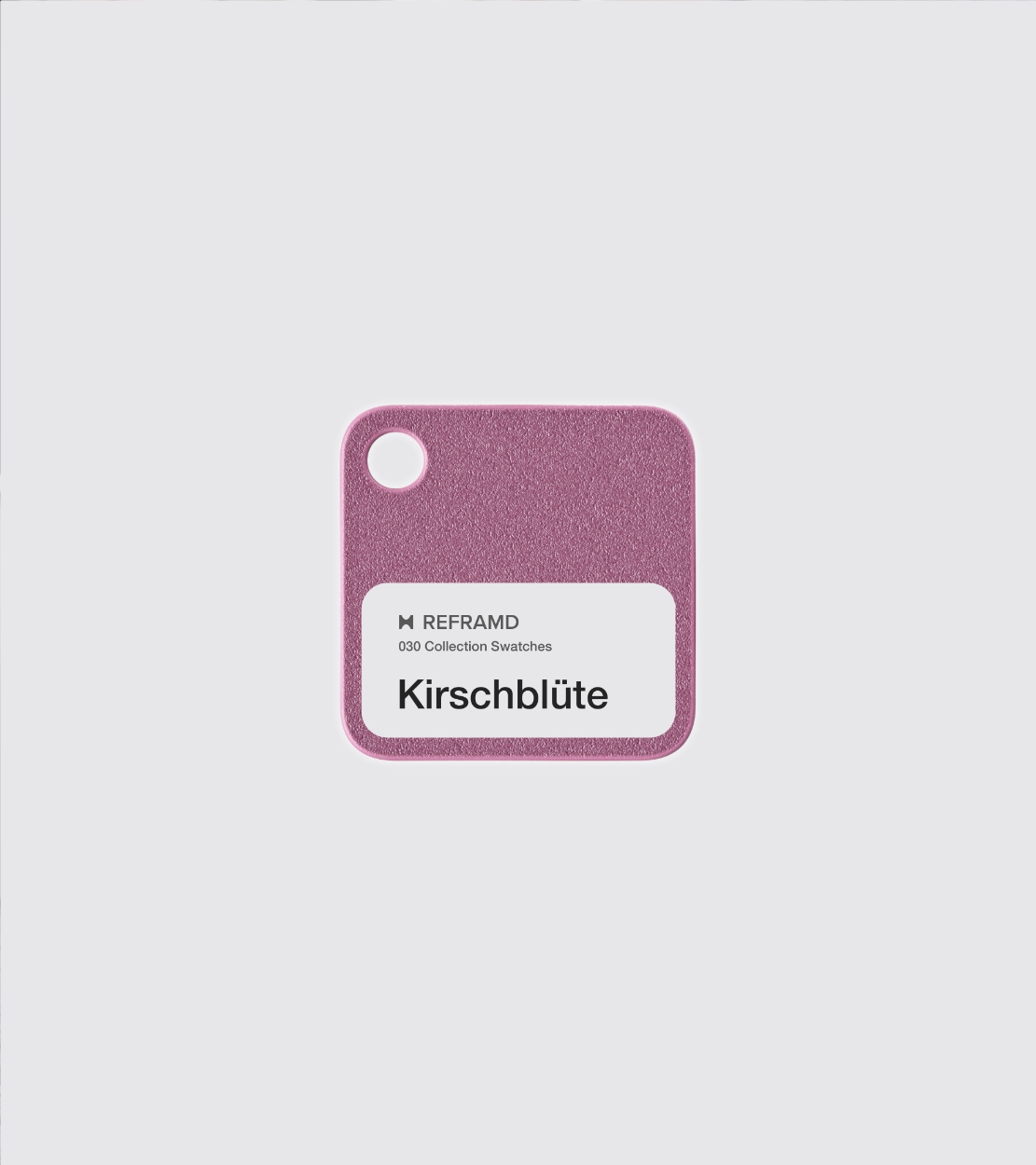



Design Philosophy
The collection extends the REFRAMD fit system beyond geometry into color, material expression, and language. Form, fit, and naming operate within a unified framework that balances coherence with variation across the collection

Outcome
Naming becomes part of the product system. Coherence across the collection, distinct identity per frame, no reliance on visual excess.
Colour treated with the same structure as the product itself.